Anime (like music) has many genres; your action-packed fighters, your feely-type cryers, your parody-filled laugh out louders, and your cringe-worthy contenders. For many fans like ourselves if an anime title has a badass opening like Soul Eater (I love you TM Revolution), then you expect the anime itself to have the give you the same thrill you felt during the OP, right? Even the ones that some may consider ‘mid’ or ‘L’ in plot and character development have some decent openings. However we’re not touching on anime openings as we’ve already done that, instead we’re touching on the thing that appears during the anime openings; the Title Cards! Although they’re barely talked about if at all, sometimes title cards can give you an idea of what the atmosphere, feelings, and attitude of the show that you’re watching will be about. For this post we’ll be taking a look at some of the best, mid, and worst title cards in anime history in terms of their color scheme, and what feelings and vibes you get from them.
So let’s get started with one of the most well known anime logos! Dragon Ball!
Dragon Ball
Every 80’s and 90’s kid has grown up with this franchise. Goku, the saiyan of Earth fighting various villains who pose both world and universe-ending threats. Let’s kick this off with the first logo; the original Dragon Ball logo gives off a vibe of nostalgia with its drop shadow effects and retro shaded colors. It gives you a sense of adventure, excitement, and danger, as Goku begins his quest to collect the seven dragon balls from the forces of evil. The 1996 logo appears to be going through the adolescent transition that everyone has gone through once in their lives. The ‘O’ is basically the one-star dragon ball; which stays in the logos following up afterwards with its first return in the iconic Dragon Ball Z logo. There’s not a single shonen fan who doesn’t recognize this logo, and the feeling you get from it can only be described as an edgy 90’s teenager going through puberty.
When the 2010’s hit they brought back the iconic look but did a shadow gradient on the bottom, and made the one-star ball slightly bigger with a lighter circular fade in the middle. At this point they wanted to appeal to the next generation of Dragon Ball fans while still keeping the nostalgic look older fans have come to know. A few years after “Resurrection F” they replaced the ‘Z’ with Super, but still kept the iconic look of the logo. We’re not gonna talk about GT’s logo because it looks like something a high school freshman who took one graphic design class threw together. (No offense if you’re in this camp, but we’re pretty sure ya’ll can make a better GT logo than what we got.)

Shonen Anime Logos
Shonen anime is always action-packed and usually has those “never give up” type of characters that are usually the MC, but what about their logos? One Piece’s logo actually gets straight to the point because it tells you that the series is gonna be about pirates. The ‘E’ is a ship’s anchor, whereas the ‘O’ is actually the logo of the flag on Luffy’s ship; and the ‘I’ is a red silhouette of Luffy himself! FMAB made their logo look like actual metal with the word ‘Brotherhood’ being the same color as Edward’s jacket. Bleach’s logo has the flames on both sides representing the many fire-based attacks found in the show, along with Soul Reapers, Hallows, and Ichigo. Attack on Titan’s logo gives me a feeling of dread, survival, and giant naked mutant men; which is basically what the series is about! The red slash line could represent the wall that the titans are on, but that’s just our theory.
Hunter x Hunter’s logo gives me the same feeling I got when I watched Dragon Ball, and Naruto along with its Shippuden logo kinda felt like it was trying to take the Dragon Ball to Dragon Ball Z route in terms of its logo, and the attitude of the series. In a couple of ways…it did. I’m not getting One Piece vibes from Fairy Tail’s logo even though the ‘T’ looks like a hook, and Seven Deadly Sins…there’s a compass in the logo, and it definitely gives me a sense of action, demons, betrayal, magic, and booze. (Its Fairy Tale without dragons or the ‘friendship mechanic’.)

Isekai Logos
So many of these long-ass titles from this oversaturated genre are a toss-up when it comes to plot and character development. Many of them are 12 episodes long with some of them making it to season 2, but for the rest of them, it feels like they’re just copying and pasting the SAO or Log Horizon formula (for the JRPG-ish ones). In terms of logo and color scheme; a lot of isekai titles appear to go for the cooler colors as their drop shadow, or just inverse them and have a thicker black stroke to emphasize what its trying to represent. I’m not sure what I’m getting from Isekai Cheat Magician’s logo, but Konosuba’s logo gives me a feeling of laughter at Aqua’s expense.

Ecchi/Harem Logos
For a small fraction of the anime community, ecchi and harem titles are the go-to guilty pleasures that most male anime fans lament over; from your panty shots to your “baka” moments. There’s little to no plot or character development in any of these titles, EXCEPT High School DxD! That series has all the ecchi and harem that you’d find…but with a purpose. (It actually HAS a story behind it!) Shimoneta’s logo is basically the “Parental Advisory Explicit Content” sticker you’d find in 90% of Hip-Hop and Rap albums. Not. Even. Joking.


At the end of the day, its not really about the logos that give you a sense of what the anime that you’re watching is about, but the feeling you get when you watch the opening as a whole. From the music to the artistic direction that the opening video is going in, anime title cards are like the frosting on a triple layer cake; it just makes the overall product look sweet. As for which ones are the best, the mid, and the worst, we’ll leave that up to you guys (if you’re into anime logos at all). For us its not just about the logo of a title alone; but what that title brings to the table in terms of story, character development, setting, and writing. With all that being said, you’ll probably be fine with this logo!
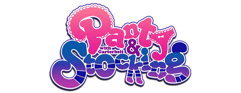
God is GOOD! Panty & Stocking’s logo was just perfect with the ‘P’ and ‘Y’ being all lacey on the top, and ‘Stocking’ resembling well…striped stockings. Garterbelt was squeezed in the middle because lets face it; he’s the middle character no one in the show cares too much about, not even the angels. Hopefully they keep this logo for the second season, as well as all of the crazy zany sex jokes and adult humor.
That will do it for our take on anime logos, so until next post, stay nerdy! 😉

Thank you for posting about this! You’re right, I can’t think of anybody that has posted about anime logos, this was a really interesting read. The logos of an anime along with the opening really do give you a good impression of what the anime is about. Conversely, when an opening doesn’t match the anime content, it always feels like a let down. Like when I watched the anime Love of Kill, I remember feeling really disappointed because the anime wasn’t as funny or light hearted as I expected. I hadn’t read any reviews before watching the series, I shouldn’t have had any expectations. It was only after I had watched a few episodes that I realized that I had that expectation because of the opening and logo.
LikeLiked by 2 people
Thanks! I feel like this subject is never really talked about that much, let alone discussed. Although anime openings give you a certain feeling about what the show is portraying, anime logos can give you a glimpse of what personality the show brings to the table. At least in our case.
LikeLiked by 1 person